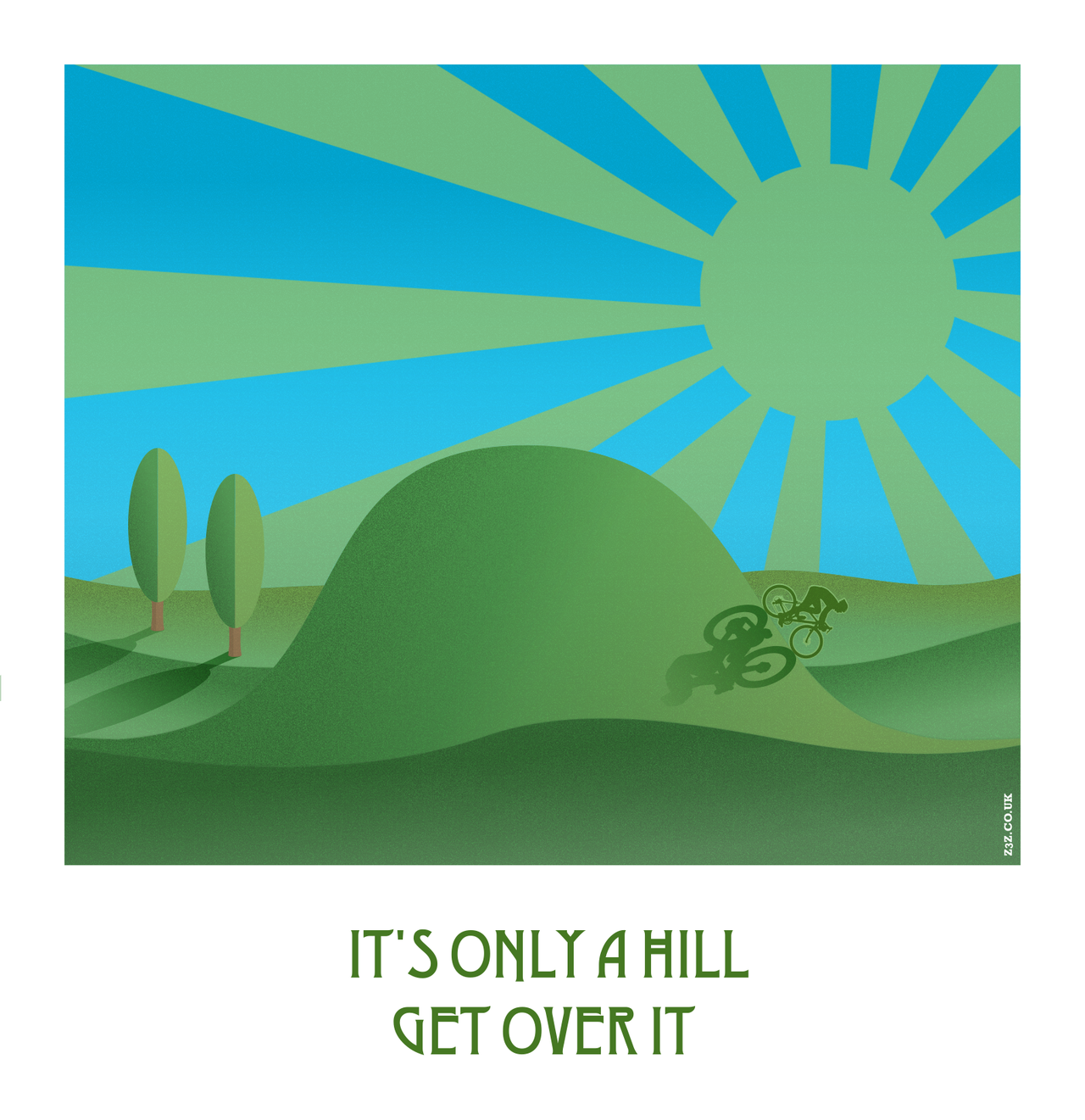
It's only a hill
Posted 05 Nov 2022
Posted 05 Nov 2022
Over on the Inkscape forums, they posted a challenge this month where users were asked to create something depicting movement. I had an idea and intended to take part. But… once I started working on my pic, I liked everything I had except the movement part (I tried arrows going from thin to thick, and from red to green, a single arrow, multiple arrows and some other ideas too.) Sooo, unless I have another idea, and the time, I guess I won’t be taking part in the challenge after all. 😐
I’ve always loved vintage art deco travel posters. There’s something so glamourous about them and I love the minimalist style. I wanted to create something inspired by that look.
I wanted to make the pic entirely in Inkscape for simplicity, and the artwork itself was no biggie. The grain, on the other hand, is a bit trickier. I don’t use filters very much, but I needed them for this look. I played about with the Noise fill filter (it’s located at Filters > Overlay > Noise fill) along with different layer blends and opacities. I quite like what I have, though it was a bit of a faff as I did each part individually. That probably wasn’t entirely necessary, but I thought it gave better results.
Anyway, this is my result. This pic is dedicated to every cyclist everywhere who has ever struggled to get up a hill!

Tags:
cycling inkscape