Part Six - Drawing mountains
Posted 15 Jan 2022
Posted 15 Jan 2022
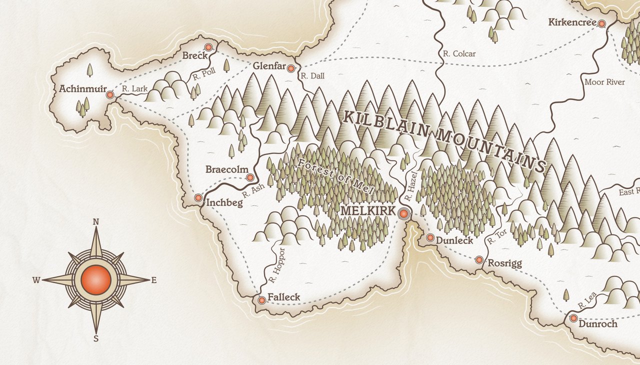
This post is the sixth part of a tutorial series that teaches how to create fantasy maps in Inkscape. This part deals with creating the mountain and hill symbols.
Here are the other sections of the tutorial.
Now onto Part Six!
Before we start, create a new layer and call it ‘Mountains’. Make sure it’s above your ‘Plan’ layer.
There are numerous ways to draw mountains, from simple triangle shapes, to complex, individually drawn chains. I said at the beginning of the tutorial that no art skills were required, and I’m sticking with that! We’re going to have a couple of fairly simple styles, but they’re still quite visually appealing.
In Inkscape, move your canvas view to somewhere just off the main page. The mountains we’re about to create will be templates, and we don’t want them to show in the main document. I like to keep objects like these just above the top of the document page, where they’re easily found.
We’re going to create three template symbols: one large mountain, one smaller mountain, and one hill. We’ll then use Inkscape’s Clones feature to create a number of copies of the originals. The clones will be positioned on the map, leaving the original symbols outside the main document.
Click on the Stars and Polygons tool. Make sure Polygon is selected and the number of corners is set to 3, with the Rounded and Randomised boxes both at zero. Hold the Ctrl key and drag on the canvas to create a triangle making sure the bottom part is level, and not at an angle.
Give the shape a stroke of 4px and colour #654f45ff (this is the same colour we used for our coastline.
We want our line art to be a consistent colour). Remove any fill colour.
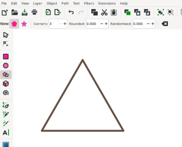
Using the dimension boxes near the top of the screen, set the height of the triangle to 150px making sure the padlock to maintain proportions is locked. Now click Path > Object to Path.
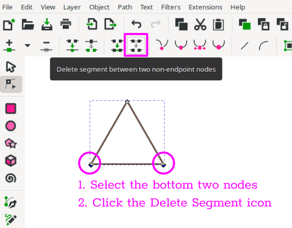
With the Node tool activated, drag the mouse over the bottom two nodes to select them, then, on the top taskbar, click the icon ‘Delete segment between two non-endpoint nodes’ (see screenshot below).
We want to give our mountain some ‘feet’, where the outlines curve out slightly at the bottom. Starting at the left side of the triangle, and with the Node tool still selected, click on the left-hand line about a quarter of the way up from the bottom. Holding the mouse button, drag the line over to the right a short distance, then drag it down a little. The line will curve nicely near the bottom. You can adjust with the node handles if you don’t get it quite right first time. Do the same thing with the right-side line. Drag it to the left and down a little. If you feel your mountain is starting to look a little skinny, click the node at the top and drag the node handles at each side outward a little. That’ll fatten it up.
You should end up with something like this…
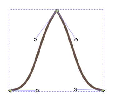
It’s looking not too bad, but I don’t like how those ‘feet’ finish. We need to revisit the ‘Taper Stroke’ path effect.
With the mountain shape selected, click Path > Path Effects to open the Path Effects panel. Begin to type ‘Taper Stroke’ in the search box and click on this when it shows in the list. The Taper stroke options will appear, and you can either accept the default, or adjust on the tapering nodes if you prefer. You should now have something like this…
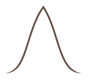
That looks much better!
There are two more steps before we finish our mountain shape. The first involves creating some hatching-style lines to add a shading effect on one side of our mountain.
To do this, start by clicking on the Bezier tool, and look at the toolbar near the top of the screen where you can select options for this tool. There’s a ‘Shape’ dropdown menu, with the default set to ‘None’. Change this to ‘Triangle In’ and set the scale to 0.3. Hold the Shift key a draw a horizontal line. I’d suggest making it about 40px in length (you can adjust the length after drawing the line via the Width box on the top toolbar). You may need to adjust these settings, depending on the size of your mountain, so take these measurements only as a guideline.
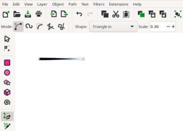
Once you’ve drawn your line, position it down near the bottom of your triangular mountain shape, so that the ‘fat’ part of the line sits on the left-hand tapered stroke of the mountain. See the screenshot below. I’ve made the hatching line pink in this example, so that you can see it clearly. I’ll change the colour to match the mountain line at the end.
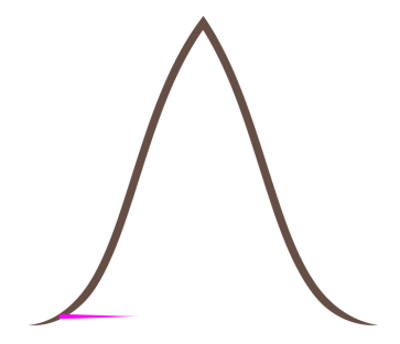
Now duplicate your hatching line, and change the length to about 10px, using the ‘Width’ box in the toolbar at the top of the screen. Drag this short line to the top of the mountain, again positioning it so that the fat part overlaps the mountain line.
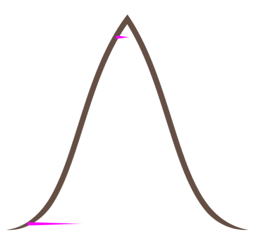
We’re now going to use Inkscape’s ‘Interpolate’ function to fill in the lines in between the top and bottom hatching lines. Interpolate isn’t a perfect solution, as we’ll still need to manually position the in-between lines, but it saves a lot of time in creating them.
Click the bottom (long) line, hold Shift, then click the top (short) line. Now click Extensions > Generate from path > Interpolate. A pop-up window will open where you can set some options. I set the value of ‘Interpolation steps’ to 20. This number indicates how many copies of your lines you’ll get between the start and end objects. Adjust to your taste. Turn on Live Preview so that you can see what the end result will look like. This is what I got after running Interpolate.
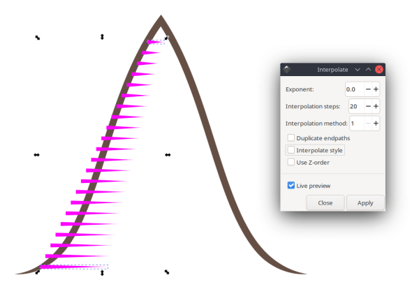
As you can see, Interpolate creates a bunch of lines that gradually change size as they go from top to bottom. But, they aren’t correctly aligned with our mountain’s edge and we’re going to have to move them manually.
The Interpolate tool always groups the paths it creates, so the first thing we need to do is Ungroup. Click the newly generated lines once to select, then press Ctrl + Shift + G to ungroup (or Object > Ungroup). Now click each of the lines individually and drag over a little so that they line up with the left edge of the mountain. Hold the Ctrl key while you do this, so that you’re not moving the line up or down.
Another step I’d suggest, once you have your hatching lines in place, is adjusting the width of a few of the lines. This introduces a little more randomness to the hatching, and makes it less perfect and even. Click the node tool, then click on a random line. Drag over the end node at the right to select, hold the Ctrl key, and drag the end node a little, either to the left or the right, to make the line a bit shorter or longer. We just want a little bit of variation, nothing too drastic! Do this with a few lines to break up the interpolate effect.
Here’s what I have so so far.
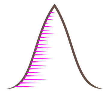
Our ‘hatching’ is now complete, and the final thing to do is create a background colour for the mountain.
Click your mountain shape, and duplicate it (just the mountain shape, not the hatching lines.)
Drag the duplicate over a little bit, so it’s not on top of the existing mountain, and turn on Snapping. Select the Bezier tool, and make sure your line shape is set back to ‘None’ (it’s probably still at ‘Triangle In’, from the previous step.) Now click down near the bottom left hand node of your mountain. The pen should snap onto the node there. Move the mouse over and click onto the bottom right hand node of the mountain, again snapping onto the node there. Now press Enter. You should have your mountain shape, plus a straight line between the two bottom nodes. Select the node tool, and drag on the centre of this line, pulling it down a small amount so that you have a very gentle curve. Adjust with the node handles if required. You should have something like the screenshot below.
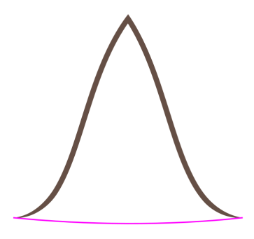
Change the stroke width to 0.1. We only want a very thin stroke that’ll align with our mountain feet. Once you have the thin stroke, click Path > Stroke to Path. This converts our stroke from a line to a shape.
Click the mountain shape, hold Shift, and click the thin curve at the bottom, so that both are selected, than click Path > Union (or Ctrl ++). This merges our two paths into one. Inkscape will likely remove the fill and give the object a stroke. Don’t worry about that, just leave it as it is.
We need the inside of this new mountain shape, and we can get that by using the Division tool.
Draw a rectangle that’s just a bit bigger than the mountain. The rectangle will be above the mountain shape, so press PageDown to lower it (or use the icon on the top toolbar that says ‘Lower one step’). It’s important to make sure the mountain shape is fully inside the rectangle and not overlapping the edges anywhere. It should look a little like this.
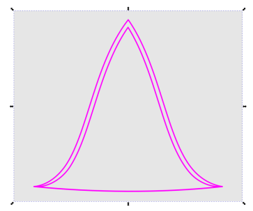
With the rectangle in place behind the mountain, holding shift, select both the rectangle and the mountain shape and click Path > Division. Running this command will give us three objects:

We’re going to create a gradient in our mountain background shape. The gradient will be darker at the side with the hatching lines, fading to white at the other side. We’re using white at the right hand side because our island colour is white, and this will let the mountains blend without any harsh transition lines. We need to set a white colour, rather than leaving the right side transparent, because one mountain symbol may sit on top of another, and we don’t want what’s underneath to show through.
Click your new mountain background to select, then go to the Fill and Stroke panel. Click on the Linear Gradient icon to give the shape a gradient. Inkscape will apply a default gradient based on the existing colour of the shape.
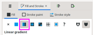
Press ‘G’ to activate the Gradient tool. You’ll see a thin blue line across the shape with a
node at each end. Click the left side node. Go to the Fill and Stroke panel and set the Fill
colour to #c2b996ff. (Make sure you’re on the Fill tab on the Fill and Stroke panel, and
not the Stroke tab.)
Click the right side node on the gradient to set the colour for this node. Go to the
Fill and Stroke panel (Fill tab), and this time set the Fill colour to white (#ffffffff).
I would also recommend adjusting the direction of the gradient to make it narrower and slightly angled, rather than a horizontal line that’s the full width of the mountain. With the Gradient tool still active, move the left node in a little, and the right node in and up a bit. You should end up with something like the screenshot below. (Note, I’ve added a small pink stroke around the edge here, so that you can make out the original shape against the white background.)
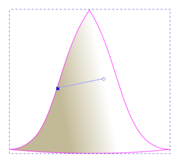
When you’re satisfied with how the gradient looks, all that remains is to position it behind the mountain outline. Move the background till it’s positioned correctly over the mountain outline, then lower it until it’s beneath the outline and all the hatching lines. Here’s my final result.
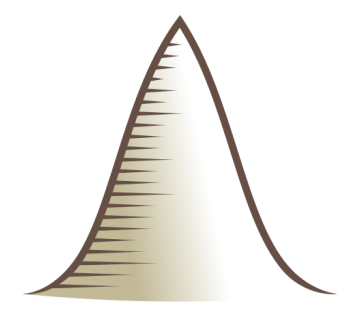
Drag the mouse over all the mountain objects and press Ctrl + G to group.
Our smaller mountain is going to be much easier to make, as almost all the work is already done for us.
Click the mountain you made in the earlier step and press Ctrl + D to duplicate. Drag the duplicate over a bit.
Click the second mountain once to select, then look at size in the ‘Height’ box in the toolbar at the top of the screen. We want our second mountain to be about two-thirds the size of the first. My original mountain ended up being about 157px high, so I’m going to make my second copy 100px tall. Make sure the padlock between the Width and Height boxes is clicked so that you maintain proportions, then enter your new value in the Height box. You should end up with something like this.
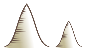
The resizing worked fine… except… look how thin the mountain outline is now, compared to the original. Scaling down the mountain has affected the thickness of both the outline and the hatching lines, but the outline is particularly noticeable.
Your map will look so much better if you can keep your lines relatively consistent in width. If our mountain outline were a simple stroke, there’s a button on the toolbar that would fix this (the hover text reads ‘When scaling objects, scale the stroke width by the same proportion’). We could simply make sure this button was NOT selected, and the stroke width wouldn’t change as we scaled up or down. Our mountain outline uses a tapered stroke however, which effectively makes it a filled path, so this won’t work.
Fortunately, there is a simple fix. Click your small mountain and ungroup it (Ctrl + Shift + G). Ungrouping is an essential step. Click the brown mountain outline once to select it, then go to the Path Effects panel (if you’ve closed it, go to Path > Path Effects). The Tapered Stroke path effect should still show there, since we didn’t ‘finalise’ the effect by converting it to a path.
Look at the number in the box labelled ‘Stroke width’. If you’ve scaled down, this number will be less than 1. All we have to do is change this number back to 1, and the stroke will become the same size as our original, larger mountain. You should see the stroke size change instantly when you update the width value to 1.
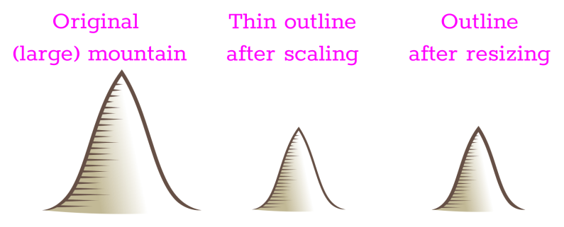
I’m not going to change the sizing of hatching lines, as I feel they work OK as they are.
Once you’ve updated the width, drag the mouse over the small mountain to select all objects and regroup (Ctrl + G).
We’ll now create our third and final symbol - a hill - which will involve repeating some of the steps we’ve done before, though it’ll go much faster this time.
Duplicate your small mountain with Ctrl + D and drag the duplicate over a bit. Now ungroup (Ctrl + Shift + G).
Delete all the hatching lines (we’re not going to use them for the hills) and also delete the background gradient colour (we’re going to recreate that). You’ll be left with the brown outline.
Activate the Node tool, and drag this over the top centre node in your mountain to select it. Look up at the toolbar for the Node tool options. The centre node on the mountain is a ‘corner’ node. We want to change this to smooth (second from the left in the node icon types). Click the Smooth icon button and your mountain will immediately become rounded, rather than pointed. You should have something like this…
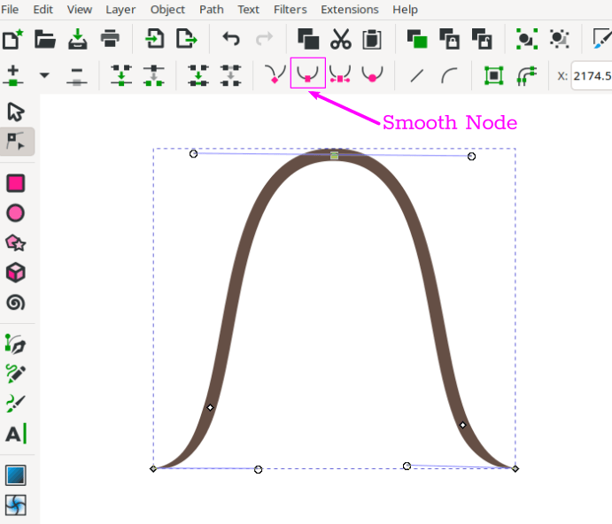
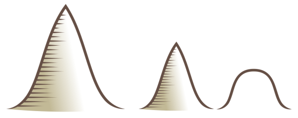
This gets us almost what we want. We just need to adjust the height. Previously, we entered precise numbers in the height box, but this time we’re going to move the centre node to ‘squash’ the shape. So, with your node tool still active, hold Ctrl and drag down on the centre node until your hill is just a little over half the size of the second, smaller, mountain. You can check the height in the dimension boxes, if you like. It should look something like this…
Because we changed the object size by directly adjusting a node, rather than using scaling, we don’t need to adjust the thickness of the tapered stroke outline this time. The line widths of all our mountain symbols are consistent.
The final task for our hill is to create the gradient fill and for this we’ll repeat the steps we did for our first mountain, which I’ve summarised below.
Duplicate the hill shape and move it over to the side a little. Using the Bezier tool and snapping, draw a line between the two bottom nodes. Pull down on the line to make a gentle curve. Change the stroke width to 0.1 and convert it to a path (Path > Stroke to Path). Now select the thin stroke and the hill outline and union them (Path > Union or Ctrl + +).
Draw a rectangle that’s just a little bigger than the hill (no overlapping!) and hit PageDown to lower it beneath the hill. Select both the hill and the rectangle and click Path > Division. Delete the two unwanted shapes leaving the inside shape (see Fig 12 above). Position this shape inside the brown hill outline.
Now go to the Fill and Stroke panel and, on the Fill tab, click the Linear Gradient icon. Inkscape will apply a default gradient based on whatever colour the fill was, but you should see the other gradient we’re already using listed underneath. Click on this gradient to apply. Finally, press ‘G’ to activate the Gradient tool and adjust the gradient so that it looks similar to the other mountain gradients.
When you’re done, lower the background gradient beneath the mountain outline, then group both objects. Now save your work, and run Clean Up Document.
Here’s my final result.
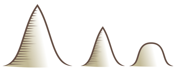
This was been quite a long tutorial, but it’s covered quite a few Inkscape techniques that you can develop further on your own. We’ve created a couple of mountains of different sizes, and a smaller hill. In Part Seven, we’ll begin placing these on the map.
Tags:
inkscape mapmaking map-tutorial