Part Two - How to make an island
Posted 05 Jan 2022
Posted 05 Jan 2022
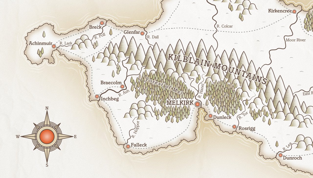
This post is the second part of a tutorial series that teaches how to create fantasy maps in Inkscape. This part deals with creating the background/sea area, and the island shape.
Here are the other sections of the tutorial.
Now onto Part Two!
We’re going to create a layer that will serve as the sea/ocean background, and our island will sit on top of this. On the layers panel, there should be a default layer created called ‘Layer 1’. Rename this to ‘Background’.
Now select the Rectangle tool and draw a rectangle that’s just a little smaller than the page border. On the toolbar near the top of the screen (roughly near the middle), there are boxes labelled ‘W’ and ‘H’ where you can set the dimensions of an object. With the rectangle still selected, set the Width to 3408px and the height to 2380px. (Note, don’t confuse the height and width boxes with the co-ordinates boxes which are labelled ‘X’ and ‘Y’.)

I have set the rectangle to be just a little bit smaller than the page size since many printers won’t print right to the edge of the page. You can make the rectangle the full size of the document (3508 x 2480) if you prefer.
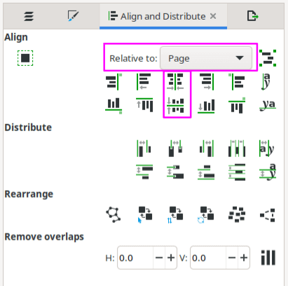
Make sure your rectangle is correctly positioned in the middle of the page using the Align and Distribute panel. On the ‘Relative to’ dropdown menu, select Page, then use the buttons to align vertically and horizontally as shown in Fig 2.
I haven’t discussed colour yet, and obviously that’s crucial to how your map will look.
I’m going to suggest colours to use, but you’re welcome to tweak these to your own taste.
One of the joys of working with vectors is that it’s stupidly easy to change colours if
you change your mind. And, if you’re anything like me, you’ll change your mind frequently!
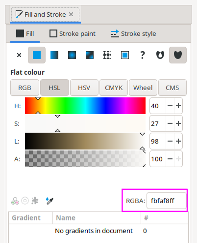
However, for now, go to the Fill and Stroke panel and set your rectangle colour to #fbfaf8ff,
a slightly off-white colour.
Save your work!
Having a nice border dramatically increases the impact of your map and we’ll be working on the border later on. However, we need to block off some space for it now, so that we don’t make our island too large.
Go to the Layers panel and add a new layer called ‘Border’. This should be above your ‘Background’ layer.
Click the rectangle in the ‘Background’ layer once to select, and press Ctrl + D to duplicate. Right click on the duplicate rectangle and select ‘Move to Layer’ from the pop-up menu. A little window will open. Select ‘Border’ as the layer and click Move.
You’ve now got two layers, both with the same rectangle on each. Lock the ‘Background’ layer with the little padlock icon to the left of the layer’s name on the Layers panel. We don’t need to do anything else with the background and don’t want to move it by mistake.
So, now on the ‘Borders’ layer, click the rectangle and change it a light grey colour (doesn’t matter what colour you pick, we’ll be changing it later on. We just want it to stand out a little from the background right now.) Now press Ctrl + D again so that we have two copies of the rectangle on the ‘Border’ layer. Make this second rectangle red.
I want to allow 100px on each side for my border, so we need to shrink down the red rectangle by this amount, then we’ll ‘subtract’ it from the grey rectangle. If you recall from earlier, our grey rectangle is 3408 x 2380px. Therefore, we need to make the red rectangle 3208 wide and 2180 high. Make sure your red rectangle is selected, then enter these figures in the Width and Height dimension boxes in the toolbar near the top of the screen (see Fig 1, but make sure to enter the smaller numbers this time).
Once the red rectangle is resized, we need to centre it. Click it once then go to the Align and Distribute panel and centre it on the Page same as we did in Fig 2 above. You should now have something that looks like this. (Note, the outer black edge in the screenshot below is Inkscape’s page border. It won’t show in the actual image.)
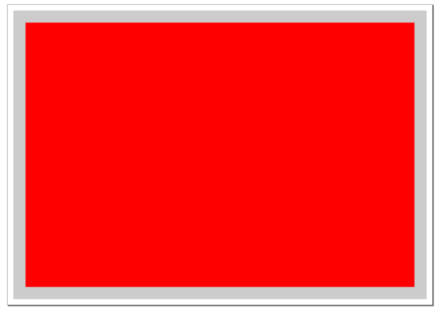
Now, click the grey rectangle, hold Shift, and click the red rectangle, then on the menu go to Path > Difference. This will ‘subtract’ the red rectangle, leaving you with the grey outside border and a hole in the middle.
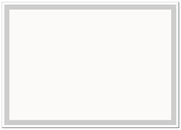
Now we know where our border is going to be, we can ensure our drawing doesn’t overlap. We’ll finish up the border later, so lock the layer for now. Save your work.
Create a new layer called ‘Island Shape’. We’ll place our island outline here.
There are many ways to create an island outline. You may have already sketched something you’d like to use. If that’s the case, either scan or take a photo of your drawing and import it into Inkscape via File > Import. Select the Bezier tool (press B) and trace around the island, making sure you close the line at the end.
You can also use Gimp to create a ‘blob’ that you can use for your island. Searching online will offer a few suggestions on how to do this, but the steps below will get you going…
Another option to create an island shape is to find a real world island to use. Go to Google Maps and zoom in somewhere (anywhere in the far north/Arctic region has loads of cool island shapes.) Take a screenshot and paste it into Inkscape, then, once again, trace out the shape with the Bezier tool.
If you don’t have a prior image to use, you can easily create something from scratch too…
On your new ‘Island Shape’ layer, grab the Pencil tool and draw a rough outline for your island. Remember, coastlines are not smooth and rounded, so don’t try to be neat. Instead, try to incorporate as much randomness as you can. Give it lots of wiggle! Include a few bays and maybe a peninsula or two. It’s important to ‘close’ your shape. In other words, make sure you finish back on top of the first node so that you have a complete shape, rather than just a squiggly line with a gap between the start and end points. The first node of the line will show a red square when you’re on top of it. This lets you know that the final node will ‘close’ the shape.
Don’t try to fill all the space up to the edge of the border. We’ll want to include a map title and perhaps a compass and a scale, so leave a little breathing room around the edges (but not too much or your island will look a little lost!) and leave one corner area blank, which can allow us to have a nice decorative title area.
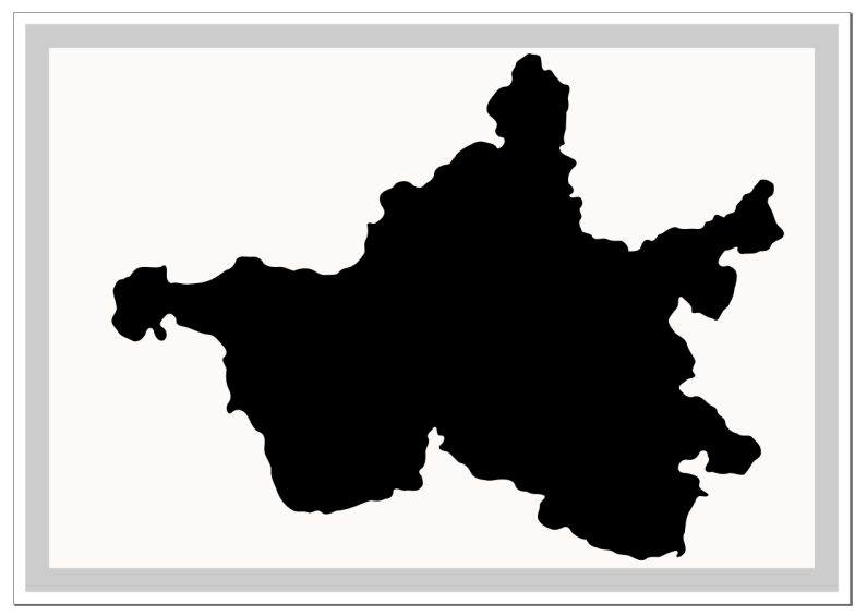
I used the Gimp noise method and this is my result after running Trace Bitmap. Notice the empty area at the top left. That’ll work perfectly for my title.
Once you’ve got your basic shape, we want to roughen the coastlines a little bit, and for this we’ll use the ‘Fractalize’ tool.
On the Extensions menu, click Modify Path > Fractalize.
You’ll need to play around with the settings a little, but start with Subdivisions: 4 / Smoothness 3. Turn on Live Preview to see how it’ll look and tweak the numbers till you get something you like. Hit Apply and close the Fractalize tool.
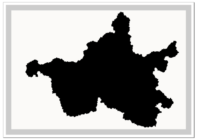
I ended up using Subdivisions: 4 / Smoothness 2, and it got me this outline. Now that looks much more random!
Island shape with a random, jagged edge
Save your work!
The Fractalize tool works great, but it will create A. Lot. Of. Nodes. This can be quite demanding on your PC, so we’re going to clean it up a little using the Simplification tool.
With the island selected, press Ctrl + L two or three times to see how it looks. You don’t want to lose that jagged edge, so don’t go too far. This is why we set the Simplification threshold to its lowest value earlier. We only want a little bit of simplifying to lose some nodes. We don’t want to smooth the edge of the coastline too much.
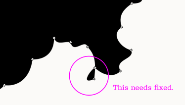
Take a moment here to carefully look around your coastline to see if there are parts that need a tiny bit of tweaking. Select the Node tool and reposition a few nodes if required. Delete any that are particularly problematic. Below are a couple of images showing the type of thing I mean. In Fig 8 there are two nodes almost on top of each other, leaving a bit sticking out. Just delete these nodes and smooth out the coastline using the handles of nearby nodes.
Example of an incorrectly positioned nod
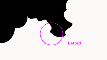
It’s a little bit of a chore going around the edges and fixing any issues, but it only takes a few minutes and makes subsequent steps easier, so it’s well worth taking the time. Zoom in reasonably close by holding the Ctrl key and scrolling with the mouse wheel. Release the Ctrl key, and you can now use the mouse wheel to scroll vertically, or hold Shift with the mouse wheel to go horizontally. With one hand on the mouse, and the other hand using the shift key, you can move around very quickly to check for misplaced nodes. Remember, the coastline is supposed to be quite jagged and random, so you don’t need to spend a great deal of time positioning everything perfectly. Just get rid of any obvious glitches. The delete key is your friend!
When you’re done. save your work.
In this section, we created the background sea layer and set a colour. We created an island shape on its own layer, and added some randomness to the coastline. In Part Three, we’ll set some colours and define our coastlines.
Tags:
inkscape mapmaking map-tutorial