Part Eleven - Roads
Posted 31 Jan 2022
Posted 31 Jan 2022

This post is the eleventh part of a tutorial series that teaches how to create fantasy maps in Inkscape. This part deals with creating roads.
Here are the other sections of the tutorial.
Now onto Part Eleven!
This part of the tutorial is pretty quick and easy, I’m sure you’ll be relieved to hear. And thank you for sticking with it this far!
Create a new layer called ‘Roads’. Place this layer BELOW the ‘Labelling’ layer. Our roads will pass through our settlements, and we want them to be underneath the settlement icons.
Roads are very, very easy to make, using Inkscape’s dashed line feature. We’ll add the dashes shortly, but let’s work on creating the roads for now.
I’m going to create a road that roughly follows the outline of my island, and this road will pass through most of the settlements along the coast. The road won’t follow the coastline exactly, as road builders would take the shortest route possible, unless there’s a geographical obstacle in the way, so they’ll skip any protruding bits of the island unless there’s a particular reason to go there. In addition to the main road, I’ll have a couple of connecting roads between towns, and a single road to an isolated village.
Think about the settlements you have on your map and how you want them to connect. Do you want to have paths in addition to the roads? For example, a mountain pass or a path through a forest?
Select the Bezier tool and click in the centre of your capital city icon. We have to start our road somewhere, so we may as well start from here. Now create a smooth-ish line that connects your various settlements. Create a rough shape, and fine tune it with the Node tool afterwards. Create separate paths for any other roads you need, and end them either at a settlement or where they intersect with another road.
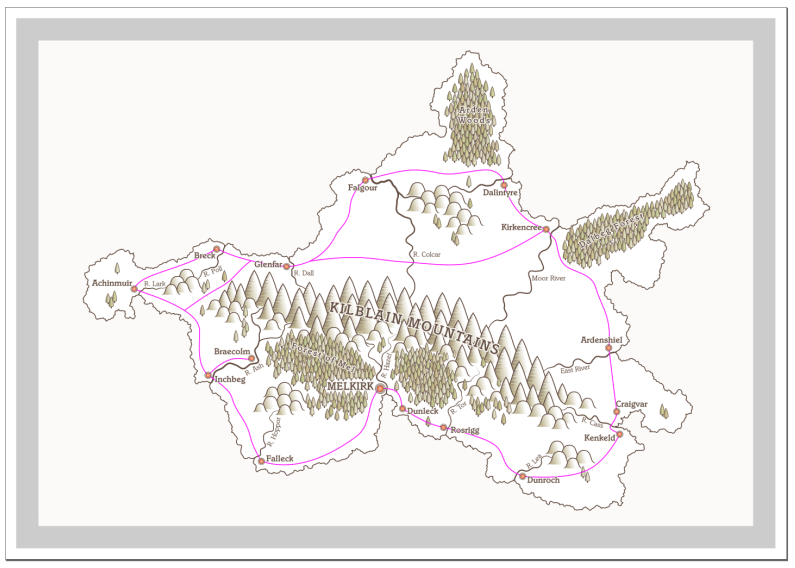
Here’s a screenshot showing my roads plan, with the roads in pink for now to make them stand out. For the tutorial, I’m not going to bother with extra paths, as it’s long enough already, but you’re welcome to create those for your map.

There are a couple of problems with the road but I’ll get to those in a bit.
Click one of your roads to select it, then take a look at the Stroke Style tab on the Fill and Stroke panel. There’s a dropdown menu labelled ‘Dashes’ and you can pick a dash style here.
There are a few options, like short dashes, long dashes, or dots with various amount of spacing in between. Decide what you want, and make sure to distinguish between roads and paths, if you’re using them (for example, use longer gaps between dots on a road.)
For my roads, I’m going for the fourth option from the top in the dashes dropdown. I’ve set the Cap and Join both to Round, which gives me a nice short stubby dash. My stroke width is set to 5px. You can select all your roads and apply the styles to all of them at once, which saves time.
Pay attention to parts where roads meet and tweak the nodes at the end so they line up nicely. See an example in the screenshot below.

Pick a suitable colour for your roads. I’ve chosen #999999ff for mine.
I’m happy with the position of the roads, but I can see a few issues where they overlap some of my labels and the odd tree. You may recall from the labelling section that it’s recommended - where possible - to avoid map elements overlapping each other. I can easily reposition an occasional isolated tree, but the settlement labels are a little more difficult. Some of them can be nudged slightly, but others have the road pass right through the middle.
Where this happens, the label should take priority over the road. We need to hide or remove the road, so that the label remains clear and legible. People will intuit that the road passes underneath.
You have two options to fix this. You can either delete parts of the path at either side of the label, or you can make a little cover-up ‘patch’ to sit on top of the road underneath the label. I’ve generally gone for the cover-up patch, rather than deleting parts of the path, because it doesn’t disrupt anything else. I might decide to add or remove a settlement, or change the name of a place, and now I want the road back, or I want it to extend a little further before it breaks into two pieces. It can get messy very quickly. A cover-up patch takes seconds to create and doesn’t cause any problems if you move things around. You can simply delete it.
So, I’m going to tweak the positioning of some of my map elements, and I’ll create a few cover-up patches.
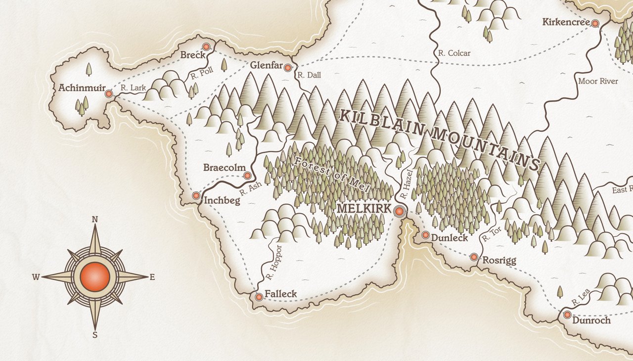
Where a road passes over a solid white background, it’s super easy to hide. Grab the Bezier tool and draw out a little shape that sits on top of the road where the label overlaps it, like the example shown below. I’ve given my patch a faint pink outline in the left example, so that you can see it. In the right example, I’ve moved the patch into place and removed the pink stroke. See how much better the label looks without the road peeking through from below?

One thing you’ll have to bear in mind, especially with labels near the coast, is that the background may not be a solid colour. Remember we added a blur in the ‘Coastline Blur’ layer? Turn that layer on, because this blur may well affect some of the patches you make.
In the left pic below, I made a white patch to hide the road, but you can clearly see the white colour at the bottom left. It blends a little better further to the right as the coastline blur fades out, but we need to fix the colouring of the patch.

This problem can quickly be rectified by adding a Linear Gradient to our patch. On the Fill and Stroke panel (Fill tab), click the Linear Gradient icon. Press ‘G’ to activate the Gradient tool. Adjust the gradient handles so that they roughly follow the ‘fade-out’ direction of the coastal blur. When we set the gradient, we want it to blend as seamlessly as possible, so it needs to be lined up with the blur effect around the coast.
After you’ve adjusted the gradient direction, click the top gradient node, then press ‘D’ to activate the colour dropper tool. Click just outside the top of your patch shape, to pick up the colour there. Now click the bottom gradient node and, again, using the colour dropper, click just outside the bottom of the patch to get the colour there. This will give a gradient that blends seamlessly with the background, leaving your label unobstructed. Tweak the gradient direction some more if the colours don’t quite match up.
Keep your patches small, just barely bigger than the bit of road they’re covering up, and you shouldn’t have too many issues.
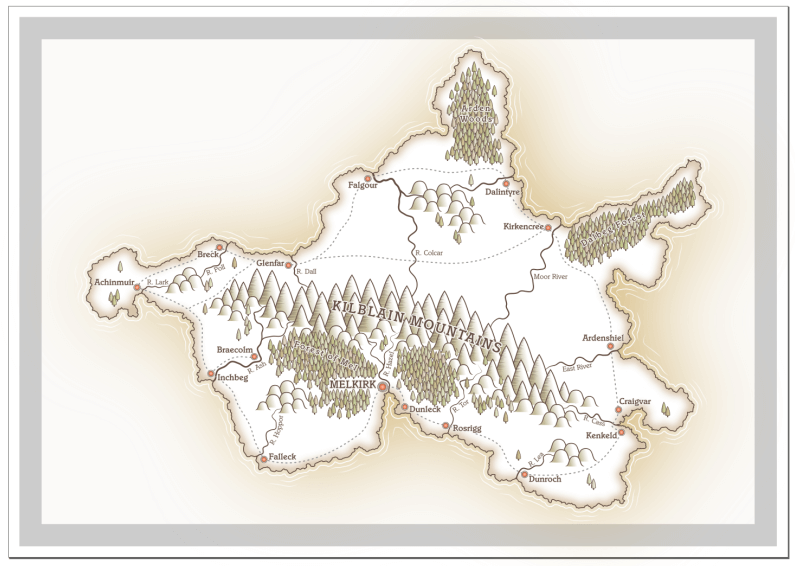
With my roads added, here’s my latest work-in-progress.

In this section, we worked on the roads, giving them a dashed stroke and fixing any issues where they intersected with our labels. In the next section, we’ll work on the border.
Tags:
inkscape mapmaking map-tutorial