Part Ten - Labelling
Posted 30 Jan 2022
Posted 30 Jan 2022
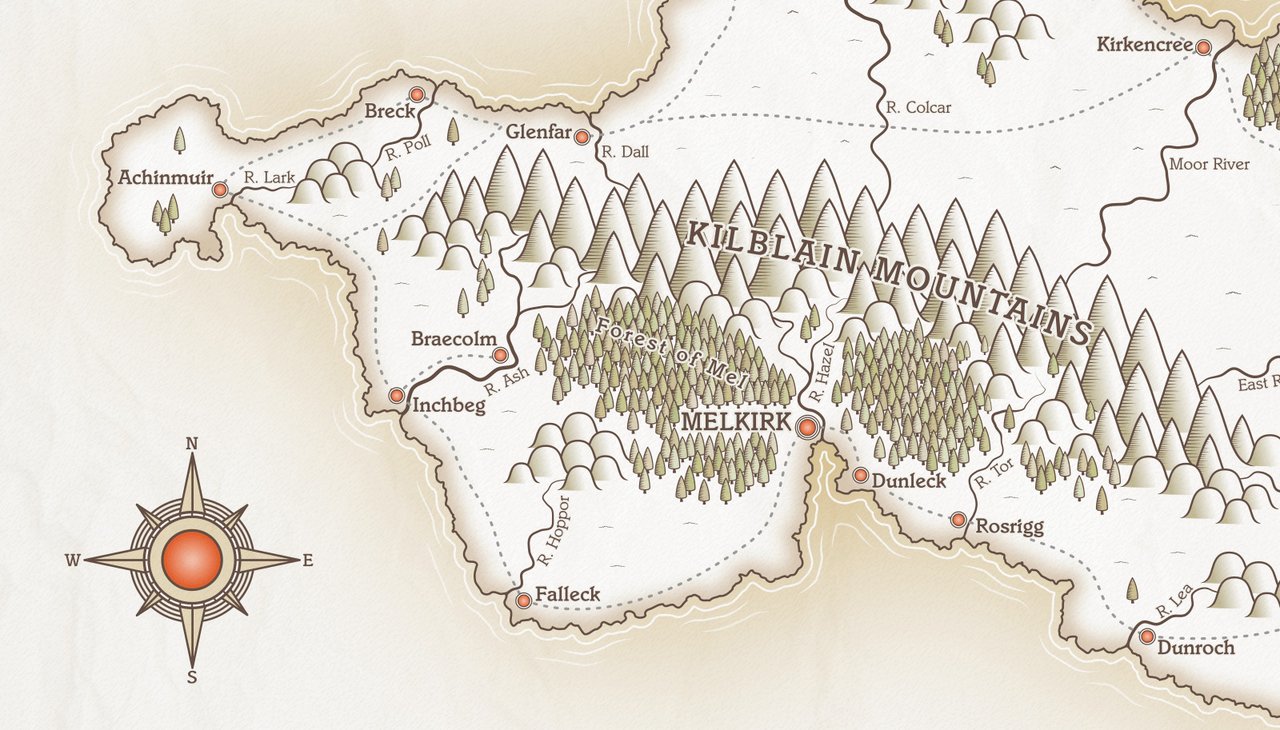
This post is the tenth part of a tutorial series that teaches how to create fantasy maps in Inkscape. This part deals with creating our town and city icons, and labelling our map.
Here are the other sections of the tutorial.
Now onto Part Ten!
We’re going to begin this section by creating a couple of icons that will depict our towns and capital city. You can really go to town (ha!) with icons, creating individual isometric illustrations to represent each settlement, but this tutorial is long enough(!) so I’m sticking with simple marker icons for small towns/villages, and one larger icon to depict the main city. You’re welcome to implement your own set of icons specific to your map, of course.
Create a new layer called ‘Labelling’. This layer will hold our settlement icons, and the bulk of our labelling. We’ll do a separate layer for the map title area later.
On the ‘Labelling’ layer, draw a circle. We’ll add a stroke later, but set it to no stroke for now, and make it 22px x 22px in size.
On the Fill tab of the Fill and Stroke panel, click the ‘Radial Gradient’ to set a circular
gradient within our shape. Press ‘G’ to activate the Gradient tool and click one of the
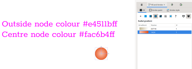
outside nodes (either one is fine). Set the colour on the outer node to #e4511bff.
Now click the centre node. Set the colour of this node to #fac6b4ff.
Duplicate this circle, drag it over a bit, and set the size of the duplicate to 30px x 30px.
Go back to the smaller circle. Click on the Stroke Paint tab on the Fill and Stroke panel.
Give the circle a stroke colour of #654f45ff.
Finally, on the Stroke Style tab, set the stroke size to 4px. This will increase the size of the circle overall to 24x24px.
Click the larger duplicate circle you made a moment ago. Set the fill to white #ffffffff
and give this circle a stroke of 4px, colour #654f45ff. This circle will now be 32x32px.
Click both circles and use the Align and Distribute panel to centre them on each other vertically and horizontally. Make sure the large circle is below the smaller one.
This icon will serve as our main settlement icon. We’ll group the two circles in a moment, but, before we do, duplicate the large, outer circle and drag it over to the side a bit.
Now select your two icon circles and group them with Ctrl + G.
Click on the copy of the large circle. Click the Radial Gradient icon, and give this circle the same gradient fill you gave the smaller one. When you click the Radial Gradient button, the gradient should be listed underneath (see Fig 1 screenshot. Your gradient number will be different, but you’ll see the gradient listed there.)
Duplicate this circle and set the fill to white #ffffffff. Set its size to 40px x 40px.
NOTE: before you resize the circle, it’s important that you deselect the icon that scales
the stroke when you change the size of an object. This icon is located on the top toolbar,
just to the right of the Width, Height and Unit boxes. When you hover over it, it says
‘When scaling objects, scale the stroke width by the same proportion’.

If you don’t switch off this icon, the stroke will get bigger as you resize, and we want the stroke width to remain consistent at 4px.
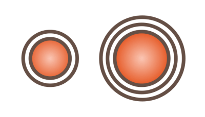
So you should now have a small circle (32x32px) with both a radial gradient fill and a stroke, and a larger circle with a white fill (40x40px). Duplicate the 40px circle and set the size of the copy to 48x48px. Centre all the circles around each other using the Align and Distribute panel, same as we did the smaller icon earlier. Use PageUp or PageDown to place the smallest circle on top, then 40px circle, and the 48px circle at the bottom. When you’ve done that, group all the circles. This will be our capital city icon.
You should have something like this…
We’ll only need one capital city icon, but we’re likely to need quite a number of town icons, therefore we’ll create a few clones.
Select the smaller circular icon, then click Edit > Clones > Create Tiled Clones.
On the Tiled Clones panel, click the Reset button to clear any previous settings, then create … let’s say 30 copies of our town icon (adjust the number for your map, but slightly over-estimate what you think you’ll need. You can delete any unused icons at the end.) Stash your original icon just above the document page to avoid mixing it up with the others. You may decide you’d rather have a different colour for your icons, so it’ll be very easy to update them all at once by editing the original.
It’s time to place your icons on the map. Earlier in the tutorial, we mentioned a few points about why settlements develop where they do (see Part Five of the tutorial). With these factors in mind, consider where your capital city will go. It’ll need to be close to fresh water and reasonably close to fertile land. On an island, it’s likely to be a port, since most islands probably trade with their neighbours for things they don’t have. Pick somewhere suitable for your main city and place your large icon there.
Moving on to the smaller settlements… we’re not differentiating between towns, villages and hamlets, so there can be quite a number of settlements, though some (or many) may be quite small places. Think about why a settlement might grow where it does. Fresh water and arable land would encourage settlement. Sheltered bays would make good bases for fishing villages. There could be some settlements close to forests, as the supply of timber would be necessary. If you’re introducing magic into your fantasy world, then there could be any number of reasons why a village grew around a particular spot. So long as the placement of a settlement has some logic behind it, you can put your icons in any location. So go ahead and start positioning them.
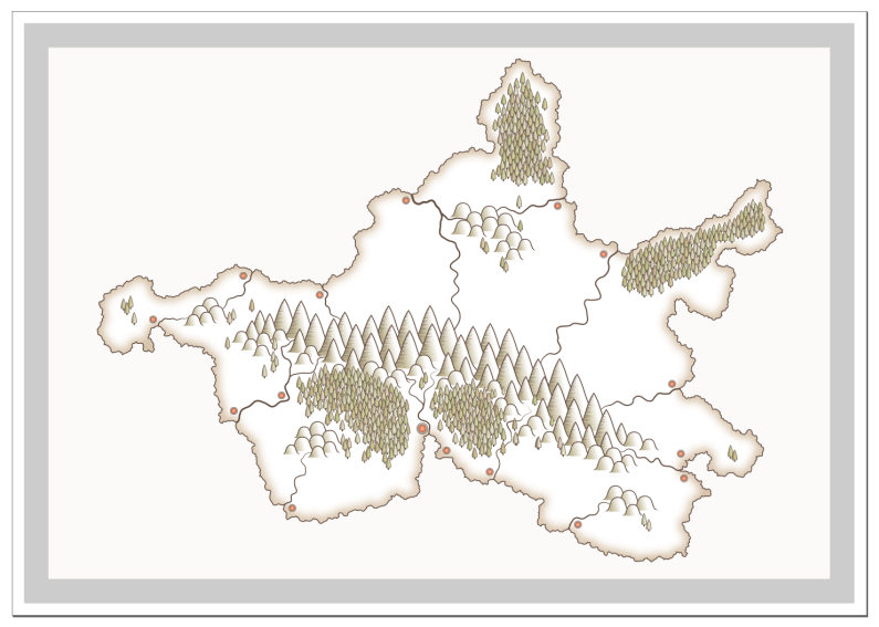
Here’s my map with the settlement icons in place.
Labelling a map is a surprisingly complex subject, with many articles published on the best way to go about it. I’ve offered a few guidelines in the list below.
The best way to become accomplished at labelling is to look at real world maps and see how professional cartographers do it.
But, onto our map!
I’m not going to tell you which font to use, as that’s down to your own personal taste and the style of your map. I would suggest that you pick a font that has multiple styles, if possible. A font that has bold and italic versions is a far more flexible choice than one that has only one style/weight.
You can get new fonts for free at Dafont.com or Google Fonts. Download and install some fonts on your PC and try them out.
If you change your mind about the font you’re using for labels, here’s a handy tip to update them all at once. Click on a text label, then click Edit > Select Same > Object Type. This will select all text objects. You can then use the Text tool options to update the font and size etc., or use the Fill and Stroke panel to change colours. All text will update at once.
Let’s think about place names. Have you created some names, or would you prefer to use a name generator to make some? Searching for ‘fantasy name generators’ will return many options to acquire place names if you don’t have them already.
Let’s get on with it.
Using the Text tool, click on the map and type your first label. Set your font size and colour.
I’m using the same brown colour that we’ve used throughout, that’s #654f45ff.
When you’ve typed the text, immediate duplicate it, and set the following options on the duplicate:
#f5f4eeff.#f5f4eeff.Now press PageDown to lower the lighter text beneath the dark, then group both objects. This gives your text a lighter edge all around, which helps it stand out from the background. It’s possible that your text may overlap a darker part of the map, and having the a small light border all around ensures it will remain legible.
If you’re wondering why I didn’t just set a stroke on the text, well, go ahead and set a 4px stroke on your text and see how it looks. Unless your text is massive, the inside of the text almost disappears and it looks bad. Using a second copy of the text allows us to have a moderately thick border, while still having legible, dark text. You’ll need to duplicate all of your text objects and set the lighter stroke and fill as explained above. Make sure to group them, so they can be easily moved.
On my map, I’ve set a font size of 40px for the towns, and I used 50px and uppercase for the capital city. I also changed the stroke width of the lighter background to 8px for the capital. My capital city label ended up in the middle of a forest, so I’ve removed and re-positioned some of the trees to make the label more legible.
Here’s a screenshot with my town and city labels added.
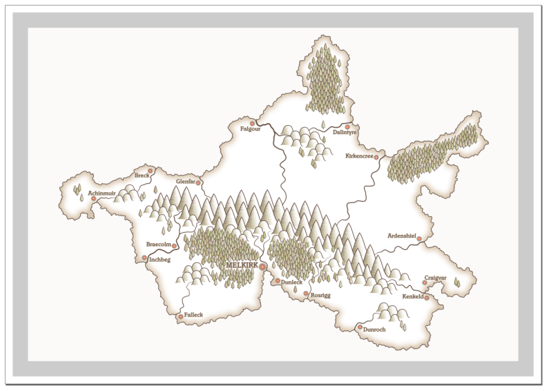
You may wish to label some of the other features of your map, such as mountain ranges, rivers, plains, forests and seas. I would suggest using Inkscape’s ‘Text on a Path’ feature for some of these. This feature allows you to put text on a curve, which is much more attractive than straight or tilted text.
I’m going to start with the mountain range in my map. I’m going to use a font size of 65px and uppercase. I’ve also set the letter spacing to 6px (on the text toolbar, look for the box labelled AA. You can adjust letter spacing here.)
Go ahead and type your mountain label text and set the size, colour and any other options you want. Don’t create the lighter duplicate right now. We’ll get to that in a bit.
It’s important to set the text as ‘Centred’, which you can do via the icon on the toolbar, see below.
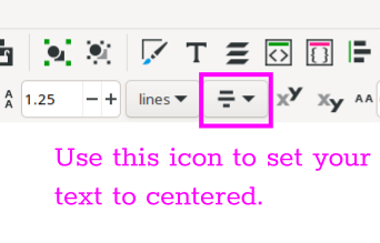
Your icon is probably showing ’left-aligned’ by default, but if you click this, a little dropdown will show and you can select the centre icon.
Grab the Bezier tool and make sure your line shape is set to None on the toolbar. Draw a horizontal line, making the line a bit longer than the text. Hold the Ctrl key to make sure your line is straight.
Now grab the Node tool, and drag the line upwards from the centre until you have a gentle curve.
Finally, with the Select tool, click on your text, hold shift and click on your line, then click Text > Put on Path. Your text will now be placed in the middle of your curving line. I’ve added a screenshot below showing my text and line, and then the text placed on the line.
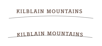
To reposition the text on top of the mountains, grab the end of the curved line and reposition where you want it. NOTE: always move the line and NOT the text. It goes a bit screwy if you try to move the text off the line, so grab the line with the Select tool and use that to position the text. You can rotate the text if desired by clicking the line twice to show the rotate handles. Just grab one of them and spin it. Your text will rotate along with the line. If you need to adjust your line, perhaps to change the degree of the curve or to lengthen or shorten it, activate the Node tool and use it to tweak as required. The text will adjust as you move the line.
There are two small problems to deal with now. Firstly, the mountain text doesn’t stand
out against the background. It needs that lighter duplicate that we created for our other
labels. So, click your text (the text this time, not the line) and press Ctrl + D to
duplicate. Give this text the same lighter colour we used before (#f5f4eeff). Set the
stroke to the same colour. You’re probably going to want a fairly thick stroke this time.
I went for a 10px stroke on my 65px text.
Once you’ve applied the colour and stroke, press PageDown to lower the lighter text below the darker label.
The second problem we have is the curved line our text sits on. We really don’t want that showing, but it’s not a good idea to delete it either in case we want to reposition or edit the text at some point (you can run Path > Object to Path on your text, and it will retain the curved shape, but it’s now no longer a text object and can’t be edited or have the angle of the curve altered.) The simplest solution is to make the line invisible. Click the line once to select, then go to the Stroke Paint tab on the Fill and Stroke panel. At the bottom of the colour sliders there’s a box labelled ‘A’ (for Alpha). Set the value of this box to zero, and the line will disappear.
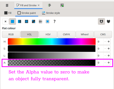
Before you deselect the now transparent line, hold shift and select both your dark and light labels in addition to the line, then group all three. This will allow you move the object or rotate it easily.
Repeat the above procedure for any other curved labels you wish to include. If you’re labelling your rivers, you can curve the text around them somewhat, but don’t make your curves too tight or the letters will start to distort. A gentle curve is generally best. If you have an italic font style available, italic can often be a good choice for rivers, as it differentiates from the settlement labels.
Don’t forget to put a label or two in the sea area. You can name the sea and any big bays.
Remember to save and clean up when you’re finished, then lock your ‘Labels’ layer.
With the labelling complete, here’s my latest work-in-progress.
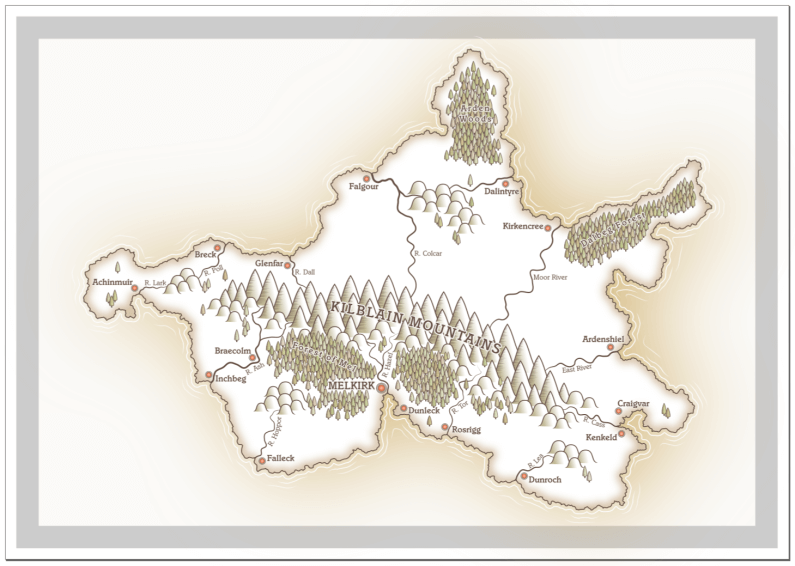
In this section, we created some settlement icons, and added the labels to our map. In the next section, we’ll create some roads.
Tags:
inkscape mapmaking map-tutorial