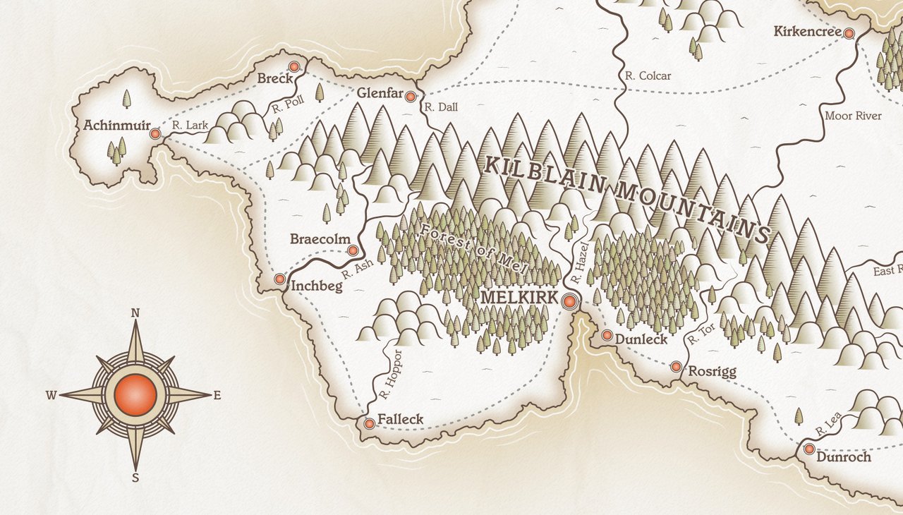
Part Twelve - Create a nautical border effect
Posted 06 Feb 2022
Posted 06 Feb 2022

This post is the twelfth part of a tutorial series that teaches how to create fantasy maps in Inkscape. This part deals with the map border.
Here are the other sections of the tutorial.
Now onto Part Twelve!
We’re finally going to do some work on that border that we made way back in Part Two of the tutorial.
Highly decorative borders can dramatically increase the impact of your map, and some artists decorate theirs with places and people from the area they’re mapping. We’re not going quite that far!! We’ll make a simple but attractive border to complement our map.
In the Layers panel, find the Border layer we made previously. It should be down near the bottom of the layer stack. Move this up to the very top and unlock it. The border layer should now be sitting above everything else.
Take a look at the border. It’s basically a rectangular shape with a hole cut out the middle. The outside edge of the border measures 3408px x 2380px, and the inner ‘hole’ measures 3208px x 2180px. This gave us 100px on each side for our border.
We’re going to create a few rectangles within the current border area for decorative effect, and to hold a pattern that we’ll create shortly. I’ll explain the measurements and sizes in each step below.
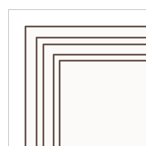
#654f45ff. NOTE: when you add the stroke, your rectangle size may change, so adjust it afterwards to the measurements stated above. Make sure you’ve deselected the icon that scales the stroke when you change the size of an object. (The icon is located on the top toolbar, just to the right of the Width, Height and Unit boxes.) Remove any fill colour. Now centre the rectangle on the page.#654f45ff. This time, set a fill colour of #f7f2e8ff.Here’s a partial view of the top left corner. Your border should look something like this. Note, the thin outer black line is Inkscape’s page border.

A common feature on fantasy maps is a striped or checkered border. It’s visually appealing and quite easy to do with vector software, although it does involve a bit of maths!
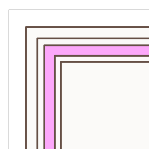
Before we get started, we need to know the measurements of where we’re putting this part of the border. I’ve updated my previous screenshot to show which set of lines will hold the checked border so that it’s easier to visualise.

So, based on the measurements of the rectangles we created earlier, I know that this rectangle is 3308px wide and 2280px high on the outer edge.
I want to create boxes that will have alternate colours and I want each box to be in the region of 250px long. The boxes will be 30px high, as this is the height of the pink area in the screenshot above. Brace yourself, here comes the maths…!
Our rectangle width of 3308px divided by 250px (the length of our checked box) gives 13.232. We need a whole number, so I’ll go for 13, since it’s the closest. NOTE, we want an odd number here, so that all our corner colours match. If your map is a different size and your division comes to an even number, you’ll need to make your boxes longer or shorter than 250px.
So, we know we’re going to have 13 segments along the top and bottom of the map, but we need to recalculate the exact width, since the figures didn’t work out to a whole number. Our rectangle is 3308px, so dividing that by 13 segments give a width of 254.461px, which is just fractionally larger than the 250px I was aiming for, so that works out fine.
Now, if you’re scratching your head over what on earth is going on here, let me show you!
Create a rectangle. Give it a fill colour of #e96d3fff. Remove any stroke for now. Resize
the rectangle via the boxes on the top toolbar. Make it 254.461px wide (yes, we do need
those three decimal places), and 30px high.
Now duplicate the rectangle and give the copy a fill colour of #e7dabaff.
Turn on snapping and grab the orange-red coloured rectangle. Move it to the top left corner of the pink area shown in Fig 2 above. The rectangle should snap to the top left corner. Now grab the pale cream-coloured rectangle and position it just to the right of the red rectangle until it snaps into place. Select both rectangles now and hit Ctrl + D to duplicate and drag the two copies along until they snap into place at the end of the first two rectangles. Keep repeating this until you have something that looks like this (I’ve used bright red and blue rectangles here just for illustration)…

If you’ve done your maths correctly, you should have 13 segments that fit inside the allocated space, and the first and last segment are the same colour. BUT… there is likely to be a small discrepancy, where the final rectangle at the right overhangs the stroke by a couple of pixels. I think this is a combination of decimal rounding and how Inkscape handles strokes, where half is inside an object and half outside. It’s an easy fix, though.
Before we adjust sizing, we need to add strokes to all our rectangles. So, drag the mouse
over all the coloured rectangles we just created to select them. Now apply a 5px stroke to
all. Make the colour #654f45ff. With the rectangles still selected, press Ctrl + G to group.
Now look at the toolbar at the top to check the sizing of the grouped rectangles. Mine came in at 3312.993px. We need the size to be 3308px, so it’s a discrepancy of just under 5px which is small enough not to worry about it. Make sure the padlock that links width and height is UNLOCKED, then enter 3308px in the width box to resize the group. The height of your boxes will have grown to 35px (which is the 30px original size plus the stroke). This is fine and we don’t need to adjust it. Inkscape has a little bug where it doesn’t always respect the measurements you enter when resizing, so you might end up with something like 3307.996px x 35.004px. Those are the numbers I got when I put 3308px in the width box. Just re-enter the correct values and it will resize eventually (you might need to do it a couple of times.)
After adjusting the width, centre the grouped rectangles horizontally on the page. They should now fit properly inside the allocated space.
With all adjustments done, duplicate the group and drag the copy down to the bottom of the page and snap into place at the bottom left corner of the border box. (It’s usually easier if you drag from near one end of the grouped object, rather than from the middle. It’ll snap easier this way.)
We’re halfway done, and need to create the sides of the border now.
As mentioned earlier, our rectangle is 2280px high. Again, we’d like our segments to be in the region of 250px high, so we divide 2280 by 250, which works out at 9.12. Therefore, we’ll work on nine segments for each side. We have to redo the division again, because it didn’t work out to a whole number. 2280px divided by 9 segments gives 253.333px, and this is the height we’ll make our checked boxes.
Create a rectangle that’s 30px wide and 253.333px high. Make it the same orange-red colour we
used before (#e96d3fff), and set it to no stroke for now. Drag this rectangle over to the top
left area of the border and snap it to the corner. The new rectangle should overlap the one that’s
already there. Don’t position it so that it sits underneath the top row of segments. It needs to be
aligned to the top left corner of the first horizontal segment.
Once your rectangle is in place, duplicate it, change the colour to the pale cream colour
(#e7dabaff), and drag this down and snap it underneath the orange-red rectangle. Keep
duplicating and dragging down until you’ve filled the space. The final rectangle will be
the red colour.
We need to repeat the steps we did before, applying a stroke and adjusting the overall size.
Drag the mouse over all the left side boxes to select and give them all a 5px stroke,
colour #654f45ff. Now group the rectangles. Check the height of the group. Mine came in at
2284.997px. We need it to be 2280px, so enter that figure in the height box. Width should be
35px which is fine. Make sure your rectangles are centred/snapped to the corner after resizing,
then duplicate and drag the copy over the right side of the border and snap it into place.
If you look at each of the corners, you’ll notice the overlap between the vertical and horizontal segments because we added a stroke. We need to union the boxes in each corner. Activate the Node tool and, holding shift, start at the top left and click the two corner boxes to select, then go to Path > Union (or Ctrl ++). Repeat this process for each corner. Finally, select all your checked border objects and group them.
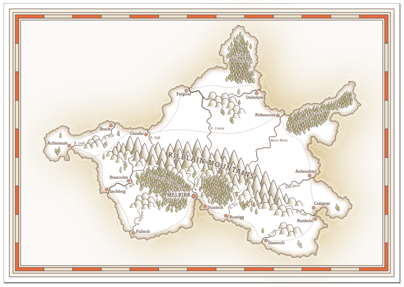
And now we have a border! It’s a simple style but still quite striking. You can adjust the colours if you’d prefer something different. You can do this quite quickly using Edit > Select same > Fill and Stroke. Click one of your rectangles to select, then run that command and it’ll select them all, allowing you to update the colour of all at once.

We created a checked border for our map and added a few other decorative lines to finish things off. In the next section, we’ll go to work on the title, compass and scale.
Tags:
inkscape mapmaking map-tutorial