Part Thirteen - Create a compass, scale and shield for your fantasy map
Posted 12 Mar 2022
Posted 12 Mar 2022
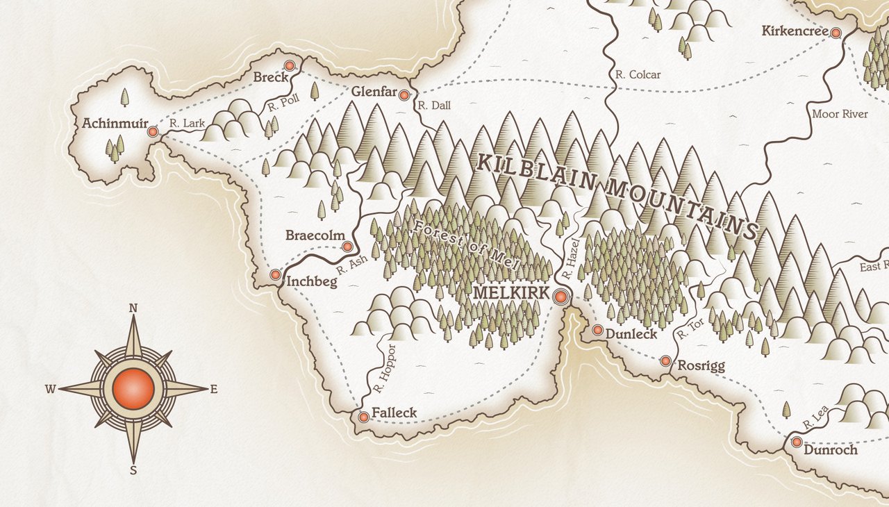
This post is the thirteenth part of a tutorial series that teaches how to create fantasy maps in Inkscape. This part shows how to make a shield for the title area, along with a simple scale and a compass.
Here are the other sections of the tutorial.
Now onto Part Thirteen!
We’re going to create a very simple scale for the map. I’m going with a scale of 10 miles for mine, as that suits the approximate island size I had in my head, but you might need to adjust the measurements to suit your map.
For all the lines we create below, the stroke size should be 4px, and stroke colour #654f45ff.
Draw a horizontal line. The width of the line should be the overall length of the scale you’re showing, so you might need to adjust the size of it. In my case, I’m going for a width of 450px to represent 10 miles.
Draw a vertical line. Make it 50px high. Snap this line onto the left end of your vertical line. The top of the vertical line should snap to the left edge of the horizontal line.
Duplicate the vertical line and snap it to the right side of the horizontal line.
Click both vertical lines, then go to Extensions > Generate from Path > Interpolate. Set the number of interpolation steps to 9, then click apply. You should have something like this…

Click the lines generated by interpolate and ungroup them.
We want to have 50px lines at the start, middle and end, but the in-between lines should be shorter.
Therefore, starting from the left, hold down Shift and click on the 2nd - 5th lines, and also the 7th - 10th lines. Change the height of these lines to 30px. Your scale should like this…

Finally, we need to add some numbers and text to our scale.
I’ve placed the word ‘Miles’ above the scale (and centred it) to indicate the measurement we’re using. I’ve then added the numbers ‘0’, ‘5’ and ‘10’ underneath, and centred them around the corresponding vertical line. My final result looks like this…
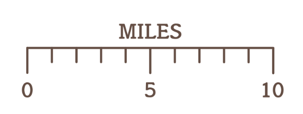
Group everything when you’re done and move the scale onto the map and position it.
Next, we’re going to create a compass. There are quite a number of steps to this, though it’s not complicated, but work through them carefully.
#f7f2e8ff. Give the circle a stroke width of 4px and a stroke colour of #654f45ff.#ffffffff).#e7dabaff.You should have something that looks like this…

With the Bezier tool, hold Ctrl and draw a vertical line. Set the stroke width to 4px, and
stroke colour #654f45ff. Make the line 220px high.
Go to Objects > Transform. The Transform panel will open at the right. Click on the ‘Rotate’ tab.
Set the Angle to 15 degrees.
Now click your line and press Ctrl + D to duplicate.
Down at the bottom of the Transform/Rotate panel, click the Apply button. The line will rotate by 15 degrees.
Press Ctrl + D to duplicate and hit that Apply button again. The new line will rotate by 15 degrees. Keep repeating until you’ve got a circular shape of 12 lines. It should look like this…

Drag the mouse over all lines to select, and click Path > Stroke to Path. Now click Path > Union. This will give you one object from the lines.
Now, draw a circle and remove the stroke (any fill colour will do, it’s only temporary). Set the size to 215px x 215px.
Duplicate this circle and set the size of the second circle to 195px x 195px. Again, there should be no stroke.
Centre the two circles on each other, with the smaller one on top.
Click Path > Difference. This will give you a ring-shaped object.
Click the ring shape and, holding shift, click the object with the twelve lines and centre them on each other. The ring shape should be on top.
Now click Path > Intersection. This command will give you twelve little pieces in a circle shape that looks something like the minutes on a clock face.

Click your ‘clockface’ shape, hold Shift, then select the shape with six circles that you made earlier. Centre the clockface on this shape. The clockface shape should sit nicely on top of the white circle, giving you something like this…
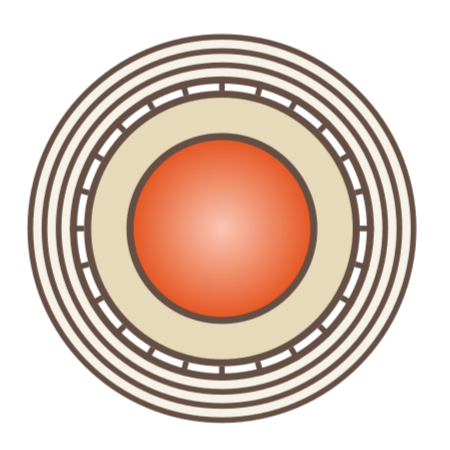
The inner part of our compass is done. Now we need to create the outer parts. We’ll start by creating a right-angled triangle.
Draw a vertical line, 4px stroke, colour #654f45ff. Make the line 240px high.
Draw a horizontal line, same stroke size and colour as above. Set the width of the line to 50px.
With snapping turned on, move the vertical line so that the bottom part of it snaps onto the left side of the horizontal line, making an ‘L’ shape.
Select the Bezier tool, and draw a line to make a triangle out of the shape. Use snapping to make sure your line connects to the top of the vertical line and the bottom right of the horizontal one.
Holding shift, click all three lines once to select. Now activate the Node tool. Drag the node tool over the triangle shape. This will select all nodes on the three lines. If you look at the taskbar at the bottom, it should say ‘6 of 6 nodes selected’.
Now go to the Node toolbar at the top left. Click the third icon from the left. It will say ‘Join selected nodes’ when you hover over it. Pressing this button will create a shape from your three lines.
Give the shape a fill colour of #e7dabaff.
Duplicate the shape and press ‘H’ to flip it horizontally. Move the duplicate till it snaps into position next to the original triangle, giving you this…
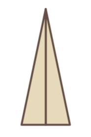
Select both triangles and group them. Press Ctrl + D twice to create two copies. Drag one of the copies over to the side. We’ll use that one later. Click the other duplicate to select, then press ‘V’ to flip it vertically. Move the duplicate down until it snaps to the bottom of the original triangular shape, giving you a long, thin, diamond shape.
Now select both parts of the diamond shape and press Ctrl + D again to make a duplicate. Without deselecting, click one of the triangles once to get the rotation handles. Hold Ctrl and rotate the duplicates until they are horizontal. You should have something like this…
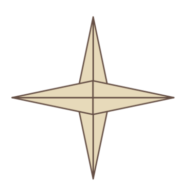
Drag the mouse over everything and group them.
We made a duplicate copy of two triangles earlier and moved it off to the side. Click on that duplicate now and resize to 175px high, using the dimension boxes on the toolbar. Make sure you have the padlock to maintain proportions locked.
Once you’ve resized, we’re going to repeat the same procedure for this smaller triangle.
Duplicate the grouped triangles and hit ‘V’ to flip vertically. Move it underneath the first copy and snap into place. Now select both pieces, and duplicate. Click once to get the rotation handles, hold Ctrl and rotate until horizontal. Once you’ve done that, group all pieces.
We want this smaller shape to be at a different angle from the larger one, so once it’s grouped, click it again to get the rotation handles, hold Ctrl and rotate it three ‘clicks’ until you have an ‘X’ shape.
Click the ‘X’ shape, hold Shift and click the larger shape you made earlier, and centre them on each other. Group both shapes.
You should have something like this…
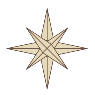
Click your triangles shape, then centre on the six-circle shape you made earlier. Lower the triangle shape so that it sits beneath the white circle (the one with the ‘clockface’ lines in it.)
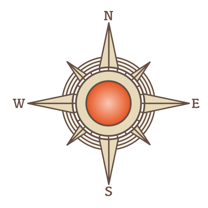
The final step is to add some letters to depict North, South, East and West. Create the letters ‘N’, ‘S’, ‘E’ and ‘W’ with the text tool and position them at the appropriate points. Use the Align and Distribute tools to centre them around the compass points. Finally, group everything, then move your compass into place on your map. You can adjust the size of the compass up or down to fit the space.
Your final result should look something like this…
We’re going to make a simple shield with a box underneath with the name of the island. We’ll start with the shield shape.
Click on the Stars and Polygons tool. Make sure Polygon is selected and the number of corners is set to 3, with the Rounded and Randomised boxes both at zero. Hold the Ctrl key and drag on the canvas to create a triangle making sure the bottom part is level, and not at an angle.
Remove any stroke and set the width of the shape to 400px, making sure the padlock to maintain proportions is locked. Now hit ‘V’ to flip the shape vertically.
Draw a rectangle. Remove any stroke. Make it 400px wide and 300px high.
With Snapping turned on, position the rectangle so that it snaps onto the top of the inverted triangle.
Click both shapes and click Path > Union to merge the shapes into one object.
You should have something like this.
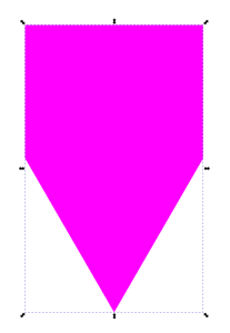
With the node tool, drag over the two nodes in the middle of the shape to select them (these nodes were the top of the inverted triangle before we unioned the shape).
These nodes are currently ‘corner’ nodes. On the Node toolbar, change them to ‘Smooth’ by clicking the ‘Smooth’ nodes icon.
Your shape will immediately curve out at the sides.
Click the bottom node and, holding Ctrl, drag it up a little, so that the overall shape is shorter and the bottom ‘point’ is not quite as long. You should have something like this…
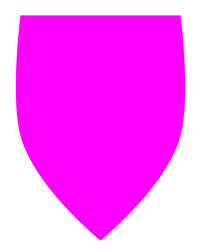
Draw a circle that’s 175px x 175px. Duplicate the circle.
Look at the snapping toolbar. There’s an icon with a ‘+’ sign with a little arrow above it. When you hover over the icon, it says ‘Toggle snapping to object’s rotation centre’. Turn this icon ON.
Now drag one of your circles to the top left of the shield shape. It should snap so that the centre of the circle is aligned with the top left corner of the shield. When it’s properly aligned, Inkscape should display ‘Object rotation centre to cusp node’ in a little tooltip.
Repeat this with your other circle, this time snapping the centre of the circle to the top right corner.
Now, select one of the circles, hold Shift, then click the shield shape to select both. Now click Path > Difference. Repeat this with the other circle.
This operation will cut two quarter circle shapes from the top of your shield.
Now, select the node tool and pull down slightly from the top centre of the shield shape. You want to create a slight downward curve at the top. You can adjust with the node handles to get it right. It should look like this…
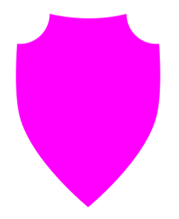
Duplicate the shield shape and change the colour so that you can see what you’re doing. Now click Path > Dynamic Offset and shrink the shield size down so that you have a small border showing between the two shapes. Something like this…
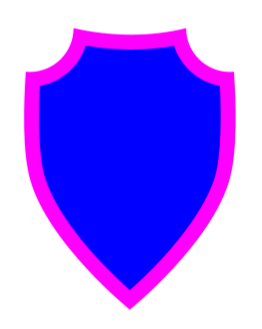
When you’re happy with what you have, click the smaller shape and ‘finalise’ the offset with Path > Object to Path.
Duplicate the smaller shield shape you just created. Give the duplicate a stroke of 5px and remove the fill colour. Press PageDown to lower this outline shape one step.
With the Bezier tool, draw a vertical line that’s a little longer than your shield shape. Using the Align and Distribute panel, centre the line horizontally and vertically over the shield shape.
Once your line is centred in place, click the line, hold Shift and click the smaller shield shape (the one that has a fill colour). Now click on menu Path > Division. This will cut your small shield into two pieces. Press PageDown to lower both pieces below the (yellow) outline shape you made earlier. You should have something like this…
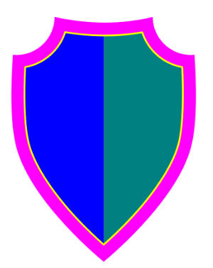
Our basic shield outline is in place, but we need something to put on the shield. I would encourage you to create a graphic for your own map, something that’s unique to the place you’ve created, but to keep things simple for the tutorial, I’m making only a very basic and simple geometric design.
Draw a rectangle. Make it 500px wide and 150px high. Click the rectangle twice to show the rotation handles.
We’re not going to rotate the rectangle this time. Instead we’re going to ‘skew’ the shape with the centre arrows, see graphic below.
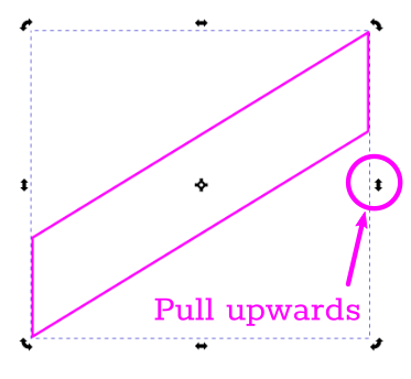
Pull upwards till you have a (roughly) 45 degree angle on the rectangle. Now move the skewed rectangle on top of the shield and position it roughly in the centre.
Click the border outline on the smaller shield (the one coloured yellow in Fig 16 above). Duplicate this shape. Select the duplicated outline, and the skewed rectangle, then click Path > Intersection. This will trim the skewed rectangle down to the shape of the shield. Press PageDown once on the trimmed shape to lower it below the border outline.
The final shield, with appropriate colours added, should look like this…
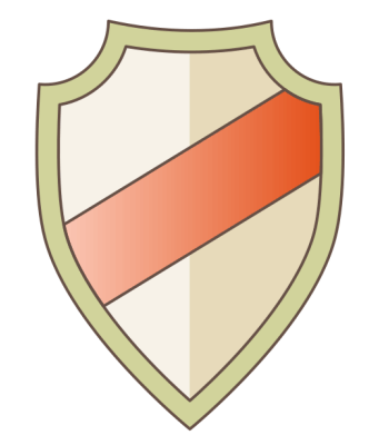
To finish up, I’m going to add a simple rectangular shape under the shield to hold the island’s name. You could add decorative elements to this, or go for a different shape entirely, or perhaps create a banner instead. But this tutorial is very long already, so I’m keeping it simple.
Create a rectangle that’s around 500px x 150px. Duplicate the rectangle and shrink it down by 15px each side (so 470px x 120px). Centre the smaller rectangle on the larger one.
Grab the text tool, pick a font and type your island name (you do have a name for your island, right??) I encouraged you to pick a legible font for your labels earlier, but it’s fine to go for something a little more decorative for the title, so hit your favourite font site and find something expressive! Make sure to centre the text inside the rectangles.
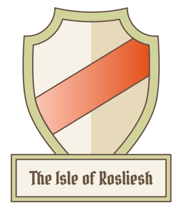
When you’re satisfied with what you have, group everything and position the title box under the shield and centre it. Now group the shield and title box and position it on your map.
I was quite restrained in my choice of font, but I feel it works. I also duplicated the text, changed the colour to a lighter shade, lowered and slightly offset it from the original text, just to give a little outline on the title. Here’s what I decided on…
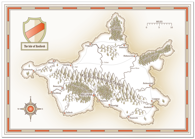
In this section, we created a title box, a shield, a compass and a scale for our map. We’re almost done with the tutorial, but we’ll try a couple of finishing touches in the next section. Here’s my work in progress after completing this stage.
Tags:
inkscape mapmaking map-tutorial