Part Fifteen - Final thoughts
Posted 18 Sep 2022
Posted 18 Sep 2022
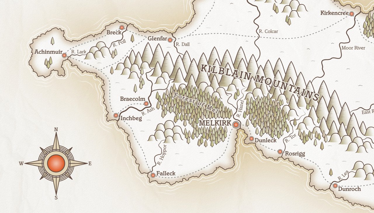
This post is the fifteenth and final part of a tutorial series that teaches how to create fantasy maps in Inkscape. This part is really just a few final thoughts on the map making process, along with some alternative images I made, showing how easy it is to tweak the look of your map with just a little extra work.
Here are the other sections of the tutorial.
Now onto Part Fifteen!
When I started writing this tutorial, I had an idea it would be fairly long, but I did not think it would extend to 14 - 15 sections. Six or seven seemed a reasonable estimate when I began, but I waffle on too much.
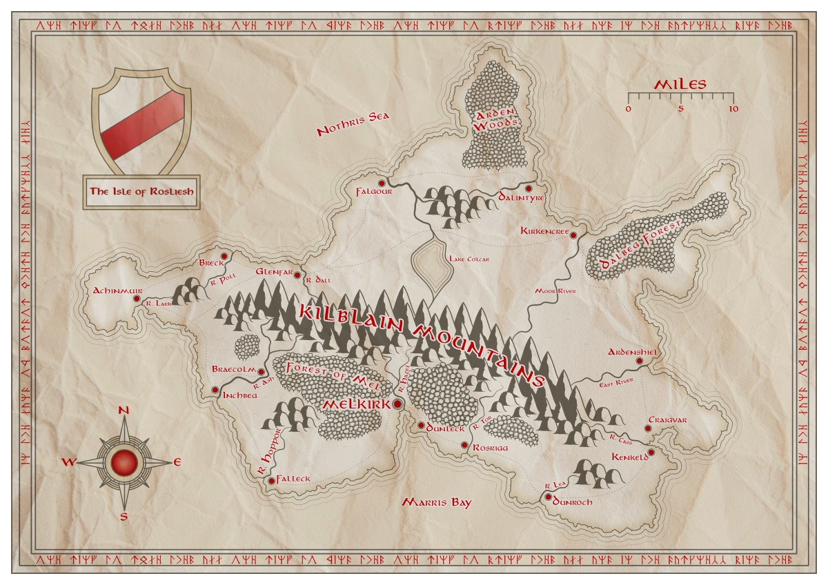
I had a general idea of how I wanted to develop the map when I started, but I got caught up in writing the posts and creating all the screenshots, and it got a little away from me. That empty-ish area north of the main mountain range… there was supposed to be a nice, big lake there to fill out the space, but I was about three tutorials further on before it dawned on me that I’d forgotten to include it (it was supposed to be part of the Rivers tutorial!) I couldn’t bear to go back and recreate everything all over again with updated images, so I skipped it. The final image feels a little bottom-heavy because of this, but oh well… 🤷
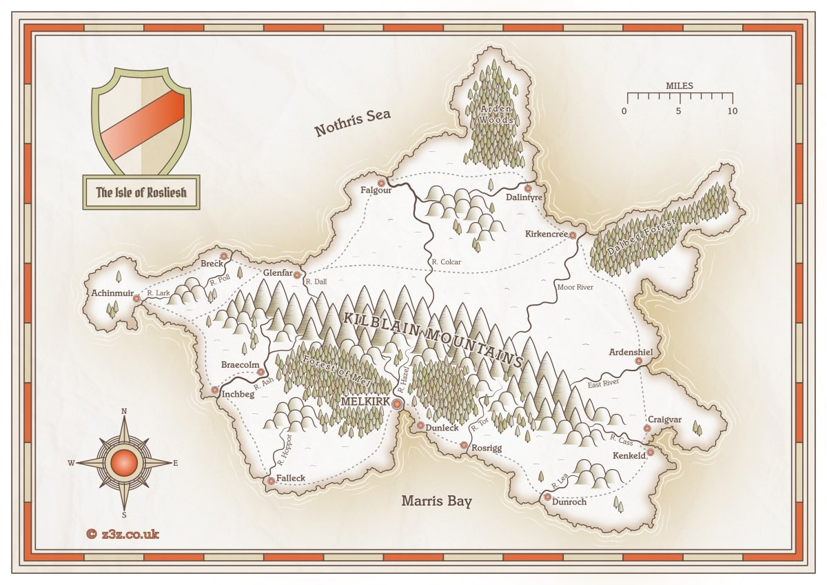
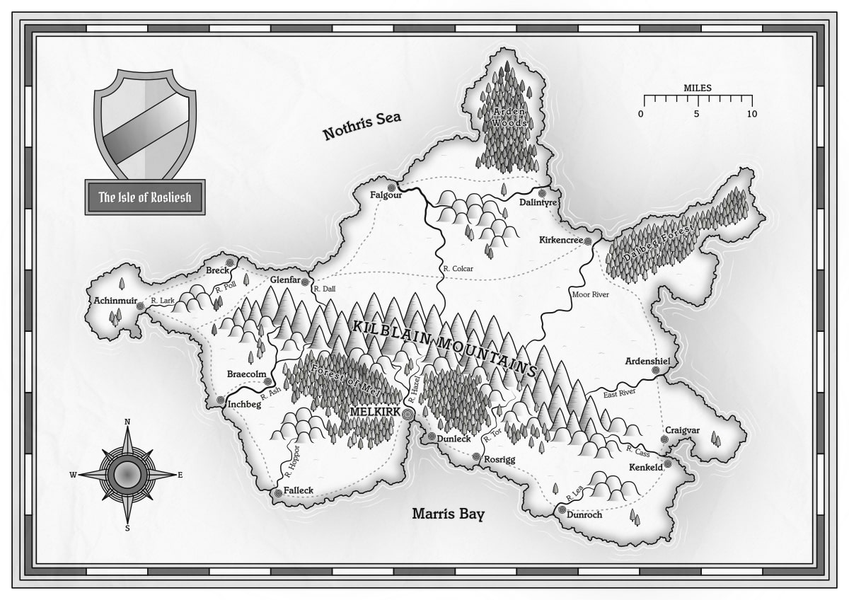
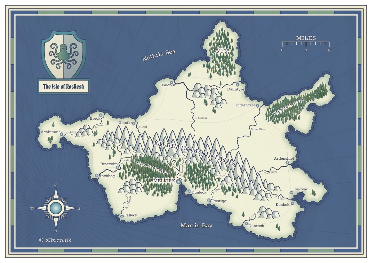
Missing geographical features aside, it’s fairly easy to update vector maps. It’s not effortless, but it’s a lot less work than starting again from scratch, and it’s fun to experiment with different colours and textures.
I made a few new maps using some different colour schemes and parchments, and it’s so cool to see how you can completely change the essence of the map without touching the geography. It would be easy to create, for example, a summer and winter-themed map of the same area without too much trouble.
Here are some more images to give you a sense of what can be done…
This tutorial is only a basic introduction to get you going. I hope you found it useful, and that you’ve learned a few tricks along the way. You can take these skills and develop them further on your own.
Inkscape is a fantastic tool for mapmaking, especially for the, err, artistically challenged among us(!) Massive thanks to the developers and everyone who devotes their time to the project. If you’ve created something great with Inkscape, consider dropping them a couple of quid to help with their costs. If that’s not an option, then help by simply spreading the word. Post your work online and tell everyone it was made in Inkscape!
Thanks for reading.
Tags:
inkscape mapmaking map-tutorial